Guide
How to Convert SVG to a React Component with JSX
Not every SVG belongs in your JS bundle. This guide explains currentColor theming,
React Native, TypeScript, SVGR vs paste-JSX, Next.js, and when not to inline an icon.
It is based on SVGEditor’s actual exporter—not a “rename attributes and hope” checklist.
Published August 6, 2026 · Updated August 12, 2026

Skip the manual rewrite: paste your SVG into the editor, then use the React or React Native export tab.
Open SVG → React converter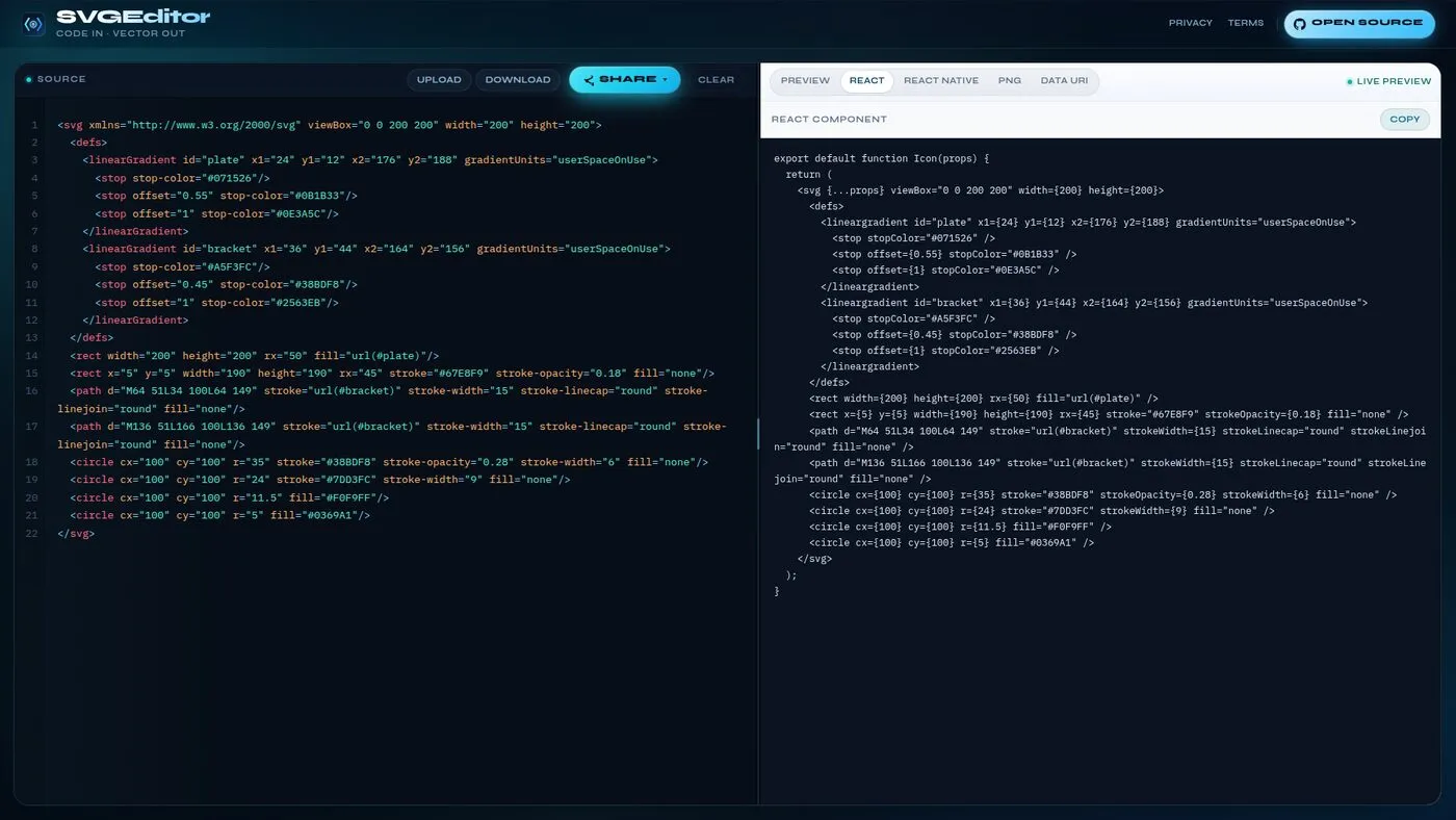
Why convert SVG to a React component?
Dropping SVG into an <img> works for static art, but components win when you
need to change color, size, or accessibility from props. Inline JSX (or
react-native-svg) lets you pass className,
width, fill, and ARIA attributes like any other React element.
Design tools often export verbose SVG. Clean it up once, wrap it as an Icon
component, and keep your UI kit consistent across web and mobile.
That said: not every SVG belongs in your JS bundle. Large illustrations you never recolor should
stay as <img> or a static asset. Reserve React components for UI chrome —
buttons, nav, and status icons — where theming and props matter.
Worked example: icon for a dark UI
A common handoff: Figma exports an icon with hard-coded #000 fills. In a dark app
that icon disappears — or fights the theme. Here is the workflow we use with SVGEditor.
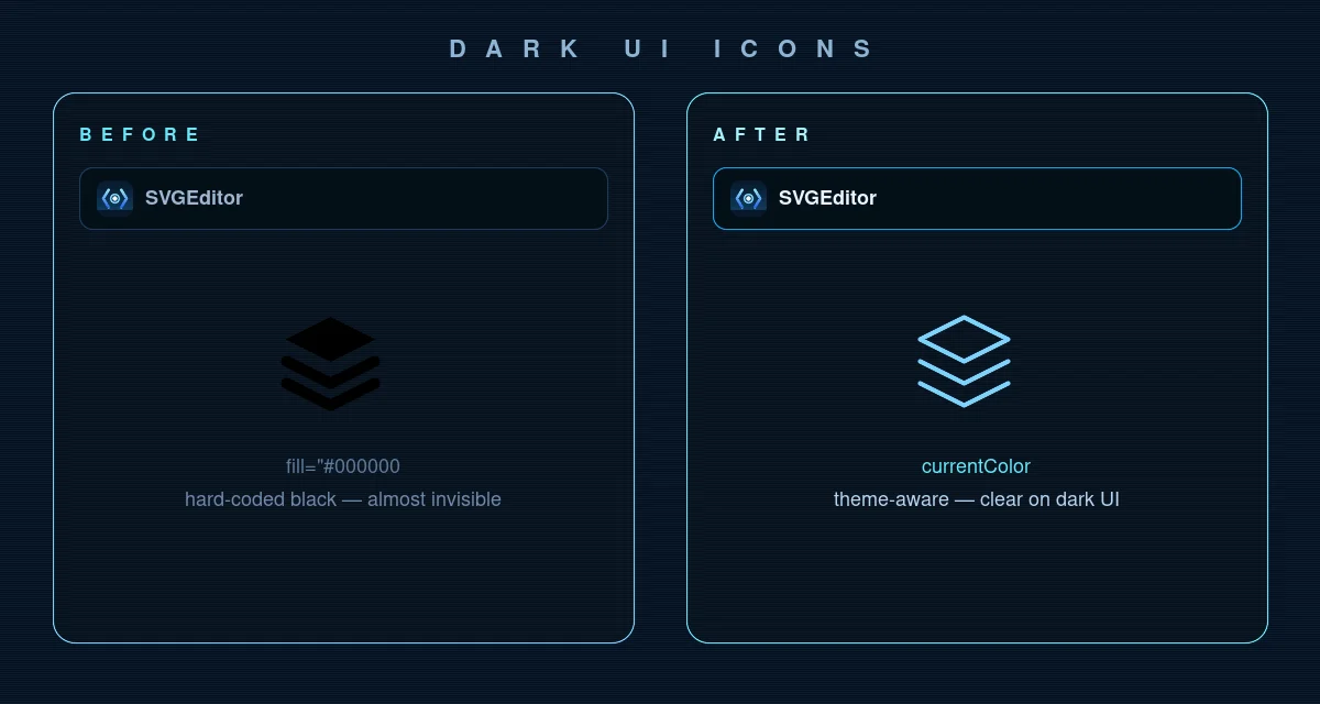
currentColor follows the theme.
Before — static SVG (fine as <img>, weak as UI chrome):
<svg viewBox="0 0 24 24" xmlns="http://www.w3.org/2000/svg">
  <path fill="#000000" d="M12 2L2 7l10 5 10-5-10-5z"/>
  <path fill="#000000" d="M2 17l10 5 10-5M2 12l10 5 10-5"/>
</svg>
After — paste into SVGEditor, keep the React tab open, then set strokes/fills to
currentColor (or edit the exported JSX once):
export default function LayersIcon(props) {
  return (
    <svg viewBox="0 0 24 24" width={24} height={24} fill="none" {...props}>
      <path
        d="M12 2L2 7l10 5 10-5-10-5zM2 17l10 5 10-5M2 12l10 5 10-5"
        stroke="currentColor"
        strokeWidth={1.5}
        strokeLinejoin="round"
      />
    </svg>
  );
}

// Nav / button — color follows theme
<LayersIcon className="text-sky-300" aria-hidden="true" />
On the React Native tab, the same markup becomes
<Svg> / <Path> with numeric props — useful when design
shares one SVG and web + mobile both need a component.
Manual path: SVG → React JSX
For a tiny icon you can convert by hand in a minute:
- Copy the SVG markup (or download the
.svgfile and open it as text). -
Rename attributes to JSX:
class→className,stroke-width→strokeWidth,fill-rule→fillRule, and so on. -
Wrap the root
<svg>in a function component and spread{...props}so callers can override size and style. -
Prefer
fill="currentColor"orstroke="currentColor"when the icon should inherit text color. - If the SVG came from an untrusted upload, sanitize first — see Sanitize untrusted SVG.
export default function Icon(props) {
  return (
    <svg
      viewBox="0 0 24 24"
      width={24}
      height={24}
      fill="none"
      xmlns="http://www.w3.org/2000/svg"
      {...props}
    >
      <path
        d="M12 2L2 7l10 5 10-5-10-5z"
        stroke="currentColor"
        strokeWidth={1.5}
      />
    </svg>
  );
}
Keep viewBox — that is what makes the icon scale cleanly when you change
width / height. Prefer numeric props (width={24}) so the
same mental model works on web and React Native.
How to convert SVG to React online
Use SVGEditor’s SVG to React converter when you want JSX (or React Native) without wiring up SVGR. You do not need an account, and nothing is uploaded to a server—typically, you can go from paste to a file in your repo in a few minutes.
-
Paste or upload your SVG
Open the converter. Paste markup into Source or use Upload for a
.svgfile. Check the live preview so fills,viewBox, and unusual markup look right before you export — conversion stays in your browser. -
Copy the React JSX component
Open the React tab (already selected on the tool page). Copy the generated
Iconcomponent: kebab-case attributes become JSX (stroke-width→strokeWidth), and{...props}sits on the root<svg>so callers can passclassName,width, and ARIA attributes. -
Or export React Native instead
Need mobile? Switch to the React Native tab. SVGEditor maps tags to
react-native-svg(Svg,Path,Circle, …), adds the import, and uses numeric props likewidth={24}. Install react-native-svg in the app, then paste the snippet. -
Drop it into your UI kit
Save as
.jsxor.tsx(type props asReact.SVGProps<SVGSVGElement>on web). PrefercurrentColorfor chrome icons so themes work. KeepviewBox; override size via props. Decorative icons getaria-hidden="true".
Prefer a bundler pipeline for dozens of repo .svg files? Use SVGR — see the
comparison below. For one-offs, drafts, and shareable previews, the paste-JSX path is enough.
React Native notes
React Native does not render raw HTML SVG markup directly. Install react-native-svg and use the generated component:
import Svg, { Path } from "react-native-svg";

export default function Icon(props) {
  return (
    <Svg viewBox="0 0 24 24" width={24} height={24} {...props}>
      <Path d="M12 2L2 7l10 5 10-5-10-5z" stroke="currentColor" strokeWidth={1.5} />
    </Svg>
  );
}
Numeric props like width and strokeWidth should be numbers in RN, not
quoted strings. SVGEditor’s React Native export follows that convention.
For TypeScript on RN, type against react-native-svg’s props (for example
React.ComponentProps<typeof Svg>) instead of
React.SVGProps<SVGSVGElement> — that DOM type is web-only.
Color theming differs too: web often uses CSS currentColor +
className; RN usually passes color / stroke /
fill as props from your theme object.
SVGR vs paste-JSX (and Next.js)
Teams usually choose between two pipelines. Neither is wrong—they solve different problems.
| When you… | Prefer SVGR | Prefer SVGEditor (paste JSX) |
|---|---|---|
| Icon volume | Steady stream of .svg files in the repo |
One-off icons, drafts, quick handoffs |
| Build setup | OK adding a Vite / webpack / Next plugin | No bundler change — just a .jsx / .tsx file |
| Preview / share | In the app after import | Live preview + share/embed link in the browser |
| React Native | Separate RN pipeline / config | Same paste flow → React Native tab |
In Next.js, do not pass interactive icons through
next/image. That helper is for raster (and some static assets); it will not give
you prop-driven fill / stroke the way an inline component does.
Prefer either SVGR or a pasted component under components/icons/.
// components/icons/Mark.tsx — pasted from SVGEditor React export
export default function Mark(props: React.SVGProps<SVGSVGElement>) {
  return (
    <svg viewBox="0 0 24 24" width={24} height={24} fill="none" {...props}>
      <path d="M12 2L2 7l10 5 10-5-10-5z" stroke="currentColor" strokeWidth={1.5} />
    </svg>
  );
}

// usage — color follows CSS / theme
<Mark className="text-sky-400" aria-hidden="true" />
For dark mode, hard-coded fills fight the theme. Export (or edit) strokes/fills to
currentColor, then set color on the component or a parent. That is the usual reason
people convert SVG to React instead of shipping a static .svg URL.
Exception: multicolor brand logos. Do not force every path to currentColor or you
will flatten the brand. Keep fixed brand fills, or expose named props
(primary / accent) for the few paths that should theme.
What SVGEditor’s React export does (and does not)
Understanding this boundary sets realistic expectations and explains why both paste-JSX and SVGR still exist.
-
Does: walk the SVG tree into a function component; map kebab-case attrs to
JSX (
stroke-width→strokeWidth); spread{...props}on the root so callers ownclassName, size, and ARIA; offer a parallelreact-native-svgtree with numeric props. -
Does not: run SVGO-style path rewriting, dedupe gradients across files, or
invent
currentColorfor you. Preview first; fix fills in Source (or in the copied JSX) when the icon must theme. -
Why
{...props}on the root: so one icon file stays flexible — buttons passclassName, tests passdata-testid, a11y passesaria-label— without regenerating the component.
Internal ids (gradients, clipPaths) can collide if you mount the same raw markup
twice on one page. Prefer unique ids per icon file, or strip unused defs after export when you
only need paths.
Leaving xmlns="http://www.w3.org/2000/svg" on a web React <svg>
is harmless (browsers already treat it as SVG in HTML). On React Native it is unused — the
react-native-svg export omits it. Editor junk
(data-name, empty <g>, unused clipPaths) is worth
stripping before you commit: smaller SVG means smaller JSX.
Sanitize untrusted SVG before you convert
JSX export does not make hostile markup safe. If the SVG came from a user upload, a paste from the internet, or a share link, treat it as untrusted before it becomes a component in your app.
-
Strip
script, event handlers,foreignObject, and hostile SMIL — the same surfaces that cause SVG XSS when inlined. - SVGEditor sanitizes on paste/upload before preview and before React / React Native export, so you do not copy a payload that still carries active content.
- For a production upload pipeline, keep a server-side (or Worker) sanitizer too — see Sanitize SVG for XSS for DOMPurify config, CSP, and the checklist.
Trusted design-system files from your repo are a different lane. Untrusted uploads are not. Mixing them is how “icon upload” features become XSS bugs.
Design-system patterns (TypeScript, refs, tree-shaking)
Once you paste JSX once or twice, the next step is a small icon kit that scales. Patterns that hold up in production:
Type props and forward refs when parents need the DOM node
import { forwardRef } from "react";

const SearchIcon = forwardRef<SVGSVGElement, React.SVGProps<SVGSVGElement>>(
  function SearchIcon(props, ref) {
    return (
      <svg
        ref={ref}
        viewBox="0 0 24 24"
        width={24}
        height={24}
        fill="none"
        aria-hidden="true"
        {...props}
      >
        <path
          d="M11 19a8 8 0 1 0 0-16 8 8 0 0 0 0 16z"
          stroke="currentColor"
          strokeWidth={1.5}
        />
      </svg>
    );
  }
);

export default SearchIcon;
Use forwardRef when a tooltip, focus manager, or animation library needs the
underlying <svg>. For most decorative icons, a plain function component is
enough.
Named files beat mega barrels
Prefer components/icons/SearchIcon.tsx over one icons.tsx that
re-exports everything. Bundlers tree-shake unused files more reliably than giant barrels —
especially under Next.js App Router.
Default size, keep viewBox, let props win
Ship a sensible default (width={24} / height={24}), always keep
viewBox, and spread {...props} last so callers can override size,
className, and a11y attributes without editing the icon file.
Stroke icons vs fill icons
Many Figma exports are stroke-based. Setting fill="currentColor" on a stroke icon
does nothing useful — and leaving fill="#000" on a fill icon breaks dark mode.
Match the paint mode: stroke icons → stroke="currentColor" +
fill="none"; fill icons → fill="currentColor".
Bundle cost: component vs <img> vs sprite
A React icon adds JavaScript to your bundle. That is fine for a UI kit of dozens of small marks, but it is the wrong default for a 200 KB illustration you never recolor.
| Approach | Best when… | Watch out for… |
|---|---|---|
| React / RN component | Theme color, props, a11y, shared web+mobile | JS weight if you paste huge illustrations |
<img src=".svg"> |
Static art, cacheable asset, no recolor | No currentColor; harder a11y hooks |
| SVG sprite / symbol | Many static icons, one HTTP fetch | Theming and tree-shaking are clumsier than components |
| PNG handoff | Email, decks, CMS uploads | Fixed pixels — see the SVG → PNG guide |
Rule we use in SVGEditor itself: chrome icons → components with currentColor;
marketing bitmaps → PNG when the destination cannot take SVG. See
Convert SVG to PNG for the raster handoff.
Accessibility and id hygiene
Decorative icons in buttons that already have text should set
aria-hidden="true" (and usually focusable="false" on the SVG) so
screen readers do not announce path soup. Standalone icons need an accessible name:
export default function SearchIcon(props: React.SVGProps<SVGSVGElement>) {
  return (
    <svg viewBox="0 0 24 24" width={24} height={24} aria-hidden="true" {...props}>
      <path d="M11 19a8 8 0 1 0 0-16 8 8 0 0 0 0 16z" stroke="currentColor" fill="none" />
    </svg>
  );
}

// Meaningful control — name the button, hide the glyph
<button type="button" aria-label="Search">
  <SearchIcon />
</button>
If the SVG ships a <title> from Figma, keep it only when the icon is the
sole label; otherwise remove it to avoid double announcements.
Next.js App Router and RSC
Pasted icon components without hooks are fine as Server Components — they are just JSX. Do not
wrap them in next/image. Client boundaries matter only if the icon file imports
browser-only APIs (it should not).
Colocate icons under components/icons/, export named components, and let the
bundler tree-shake unused files. That scales better than one mega icons.tsx barrel
that re-exports everything.
Privacy: why in-browser JSX export matters
Unreleased product icons should not hit a random upload converter. SVGEditor builds React / React Native output in the browser — same stance as preview and PNG. Share links encode the SVG in the URL hash; treat them like the file itself.
Common mistakes
-
Dropping
viewBox: the icon stops scaling cleanly when you change width/height. Keep it on the root<svg>/<Svg>. -
Shipping Figma’s
#000fills: fine on a light mock, invisible or harsh on a dark UI. PrefercurrentColor(or theme props) for chrome icons. -
Using
next/imagefor interactive icons: you lose easyfill/stroke/classNamecontrol. Use a component (SVGR or pasted JSX). -
Leaving kebab-case attributes in JSX:
stroke-widthmust becomestrokeWidth(and friends). Converters catch this; hand edits often miss one. -
Quoting numeric props in React Native:
width="24"should bewidth={24}. SVGEditor’s RN export already uses numbers. -
Reusing gradient
ids across icons: two components withid="paint0"on one page fight each other. Rename ids per file or inline unique prefixes after export. -
Pasting a full illustration as JSX: huge path dumps bloat the JS bundle. Keep
large art as
<img>/ static SVG; reserve components for UI chrome. -
Forcing
currentColoron brand logos: flattens multicolor logos. Keep fixed brand fills, or expose named color props for the few paths that should theme. - Skipping sanitize on untrusted uploads: converting to JSX does not remove XSS vectors. Sanitize first — see Sanitize untrusted SVG.
-
One mega
icons.tsxbarrel: harder to tree-shake. Prefer one file per icon undercomponents/icons/.
Production checklist (before you commit)
-
Color: chrome icons use
currentColor(or theme props); leave fixed fills only on multicolor logos. -
Paint mode: stroke icons →
stroke="currentColor"+fill="none"; fill icons →fill="currentColor". -
Size: default
width/height, keepviewBox, spread{...props}last. -
Accessibility: decorative icons get
aria-hidden="true"; meaningful controls name the button (or usearia-label), not path soup. - Ids: unique gradient / clipPath ids per file — or strip unused defs.
-
Cleanup: remove editor metadata, empty groups, and unused
xmlnsnoise on RN exports. -
TypeScript: web →
React.SVGProps<SVGSVGElement>; RN → types fromreact-native-svg. - Trust: sanitize untrusted SVG before export; never paste raw internet SVG straight into production components.
FAQ
How do I convert an SVG to a React component?
Paste the SVG into
SVGEditor’s SVG to React converter, open the
React tab, and copy the generated component. Kebab-case attributes become JSX
(stroke-width → strokeWidth), and {...props} sits on the
root <svg>. Prefer currentColor for themeable UI icons, keep
viewBox, and sanitize first if the file was
untrusted.
Is there a free SVG to React converter online?
Yes. SVGEditor converts SVG to JSX in your browser for free — no account and no file upload to a server. Paste SVG, keep the React tab open, and copy the component (button at the top of this guide).
How do I convert SVG to JSX for TypeScript?
Paste the SVG into the converter, copy the React export into a .tsx file, and type
props as React.SVGProps<SVGSVGElement> so className,
onClick, and ARIA attributes stay typed. For design-system icons that need a DOM
ref, wrap with forwardRef — see
Design-system patterns.
Can I convert SVG to a React Native component?
Yes. Use the React Native tab. It maps tags to
react-native-svg (Svg, Path, Circle, …),
adds the import, and uses numeric props like width={24}.
Should I use SVG as an <img> or as an inline React component?
Use <img> (or a static asset) for large illustrations you never recolor. Use
a component when the same icon appears in buttons, nav, and themes with different colors.
Does the converter change my paths?
SVGEditor rewrites the tree into JSX / RN tags and JSX attribute names. It does not re-path or optimize geometry the way SVGO does — preview first if the SVG is unusual.
SVGR or SVGEditor — which should I use?
Use SVGR when icons are a steady stream of .svg files in the repo. Use SVGEditor
when you need a quick JSX / React Native snippet, a live preview, or a share link without
touching the bundler.
Should I sanitize SVG before converting to React?
Yes for untrusted uploads or paste from the internet. Sanitize first so
script, foreignObject, and hostile SMIL never land in your component
tree. SVGEditor sanitizes before preview and export — details in
Sanitize SVG for XSS.
Can I share the SVG with a teammate?
Yes — use Copy link or Copy iframe in the editor. The payload lives in the URL hash on their side; treat share links like the file itself.
Related guides
Convert SVG to PNG — retina sizing and transparent downloads when
you need a bitmap handoff.
Sanitize SVG for XSS — strip
script, foreignObject, and hostile SMIL before preview, share, or
React export.
Convert your SVG now
Paste once, confirm the live preview, then export React or React Native — or download PNG / Data URI from the same workspace. Free, no account required.